The After and Before forum is organised by Stacy Fischer, it is a place where amateurs as well as seasoned photographers explain the wow and how about their photo and editing decision.You can read more here about how to take part.
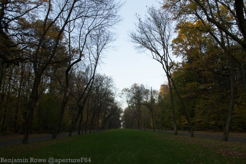
When taking photos, especially landscapes, I will usually bracket my exposures. This is not just so I can create a HDR image, but it does give me the option if I want. It is more to make sure that I have got the right exposure. It also helps when editing, sometimes making an underexposed image brighter gives a different image to a “correctly” exposed image being darkened to the same value.
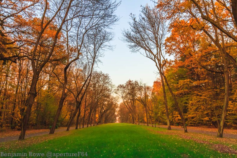
The image I am editing today was the underexposed image from the bracket. Taken in Zdrowie Park but from the other end that I took the shot for a previous After and Before forum post.
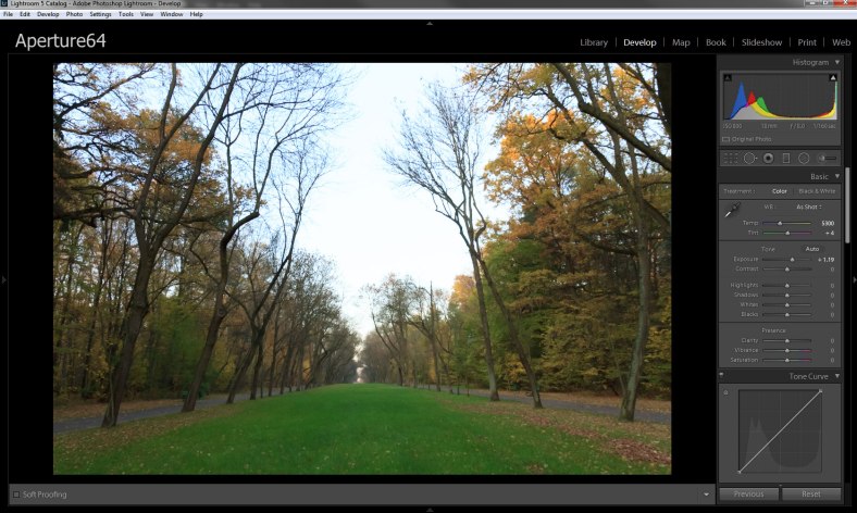
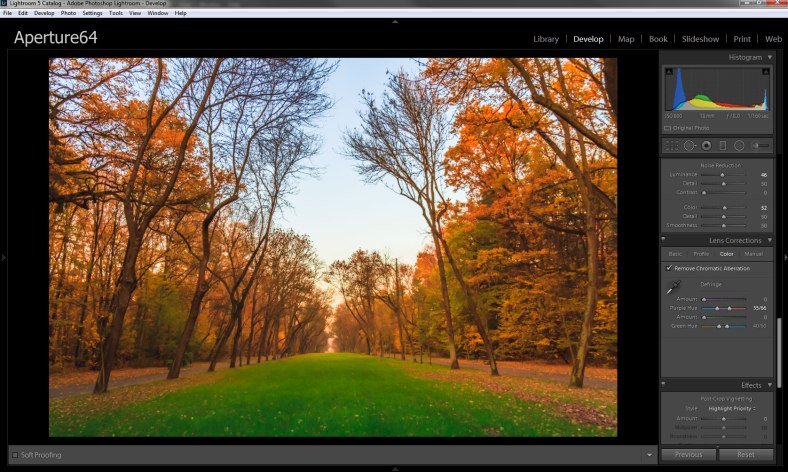
First I set the profile of the image to landscape and clicked the lens corrections boxes. I also increased the exposure.
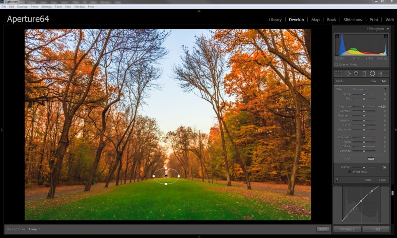
I added a gradient bringing the centre of it to the horizon line and the end point to about the midway of the foreground. I lowered the highlights to reveal more detail in the sky, I opened the shadows to get more detail from the trees and lowered the exposure to darken the area a bit. I also added some midtone contrast with clarity and added some more warmth.
The last step with the Gradient was stylistic; I added a pale orange colour cast.
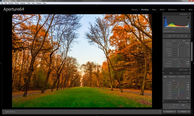
With my base work done I added a Kodachrome 25 preset for colour toning. I selectively increased the blue saturation and adjusted the orange and green hues to make them balance more. I also increased the clarity and vibrance to give the image a kick.
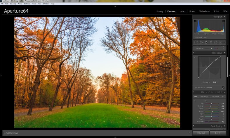
I added a curve to brighten the whole image but more especially reduced the contrast in the blacks.
I wanted to emphasise the focus point where all the leading lines converge. I added a radial tool and reduced the exposure. This gave the effect similar to a very large vignette but more subtle.
Finally I sharpened the image and worked to reduce chromatic aberrations.
The picture was taken at the beginning of Golden Hour, but the colours were missing from the shot. In adding the warmer tones it emphasises that. The green in the works well with the orange and the subtle blue in the sky gives some relief from the stronger colours. For me this is one of my best images of the season so far.
I would really like to know what you think about the image, let me know in the comment box below.
Also please head over to Stacy’s blog to see the other participant’s version of the image.
Remember if you liked this post to; like, share and subscribe.
If you wish to get notifications when I post on my blog, you can follow me on Twitter@apertureF64, on Facebook.com/aperturesixtyfour or alternatively be emailed by subscribing below. All images are the Copyright of Benjamin Rowe , ALL RIGHTS Reserved unless credited to another photographer. For more information please read my Copyright Statement

As a photographer who is not that technical (yet), I love all your details. Gradient is something I have avoided as I can’t seem to make it work yet. I will have to play around some more now! Thank you for all the info on your post and what a stunning image! It’s nice to see the transformation from a great photo to WOW.
Hi, the gradient tool is one that can be used obviously or subtlety, it all depends how far you big the transition is. The larger the transition the less obvious it becomes.
I am glad you like the end result and thanks for commenting.
The result is incredibly beautiful, Ben. Thank you for explaining it step by step. I have avoided the gradient too, will give a try. 🙂
The gradient and radial tools in lightroom once controlled give an kmage an added dimension. Give them a go.
Thank you, Ben.
Amazing! a brilliant image from a quite drab one. Thanks for explaining your process so well, maybe I’ll have a go at some of my drab and boring autumn pictures. Great work Ben!
With autumn the secret is making the yellows stand out from the mainly monochrome tone of everything else.
Amazing rescue of an underexposed image. The colors and tones are excellent. Very well done.
Thank you Robin, out of the three exposures I chose the under exposed shot because it had the most shadow detail that I could take advantage of. Apart from the grass all thebother colours really are artificial.
They may be artificial, but it doesn’t seem that way which is the important thing. Thanks.
Thank you Robin.
Ben, it was fun to read about your processing in Lightroom (I could understand it all!). You introduced me to the use of color with the gradient – something I never knew about but will definitely have a go of it. One question, how did you manage to keep the orange from effecting the beautiful green in the grass? I oftentimes use the radial tool to create a specific vignette, usually piggybacking one to burn outside the filter and then copying it and dodging the inside. So it was fun to see you use it here. Beautiful fall image. And thanks for, once again, teaching me a bunch of new things with a program I use all the time!
Hi Stacy, glad you understood it all while I am backno familiar territory. The grass retained it’s color because the orange was added in the gradient. I positioned the gradient so the effects would be transitioning from the horizon line preseeving the colour in the grass.
Hope that still made some sense.
Yup, it does, Ben. I guess you did say that in your post, I just missed it. Thanks for clarifying!
I am quite conscious that when i write that things may get muddy especially when it comes to editing. Glad all is clear as crystal.
Amazing transformation. The biggest issue I would worry about would be CA / colour fringing but you must have worked hard as I don’t see it.
The CA/ colour fringing was an issue especially in the branches. Lightroom’s tool is quite effective but also like taking a sledgehammer to put a nail in a wall. To be honest I went back and forth with that part of the editing.
Really glad you cant see any.
Thanks for commenting Andrew
What an amazing edit, you balanced everything just perfectly. When I read your posts, I always regret not having access to Lightroom, to check it out.
I like what you were able to pull from the original image and I enjoy your explanations. They are always so understandable. My only minor) complaint is that I felt the saturation on the grass was a bit oo much. Your focus, to me, is the autumn colors of the trees and the grass is slightly distracting. But overall, I love it!
Emilio, I understand what you are saying with the green being a bit to much it distracts slightly from the other colours. I will have a look and see if I can tone down the greens and bring the focus back to the autumn tones.